Understanding the Basics of Color Psychology
How Colors Speak to Our Emotions
Imagine walking into a room bathed in soft blues and gentle greens. Instantly, your shoulders relax, and there’s a subtle exhale you didn’t realize you needed. That’s the magic of color psychology: hues that don’t just decorate your walls – they speak to your very soul.
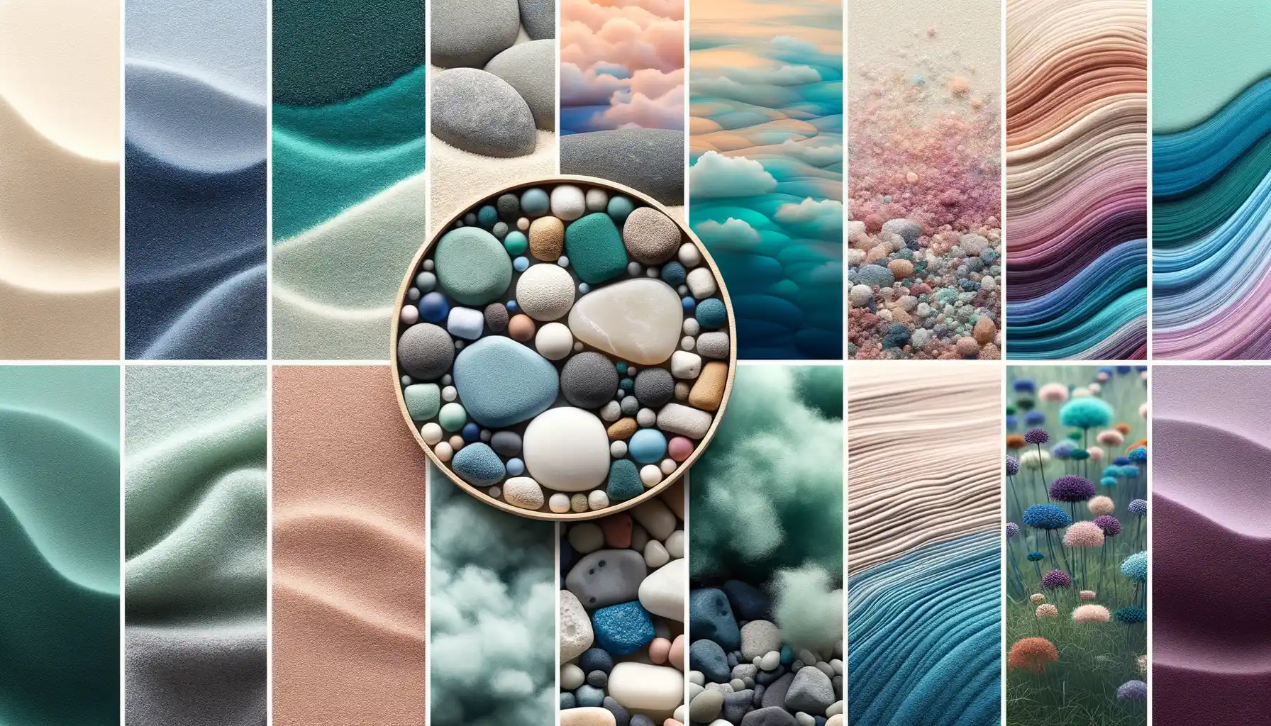
Colors have personalities, just like people. While vibrant reds might scream excitement or even a touch of urgency, shades like pale pink whisper comfort and serenity. Think about it – why does a blazing sunset ignite your sense of wonder while a gray storm cloud tugs at your mood? It’s all about how our brains interpret colors emotionally.
Scientists and designers alike have found that certain colors consistently evoke specific feelings:
- Blue: The ultimate stress-relief. Picture a vast, calm ocean.
- Green: A grounding force, like a quiet forest after rain.
- Yellow: Sunshine bottled into optimism – but too much might feel overwhelming.
Once you start noticing these patterns, you’ll realize every shade in your home holds potential to shift your energy – for better or worse.
Your Home, Your Emotional Palette
Your home is more than furniture and walls; it’s an extension of your inner world. The trick is realizing that each color is a brushstroke on your emotional canvas. Try this: Recall a space where you felt completely at peace. What colors surrounded you? Maybe it was the sandy beige of a beachside retreat or the warm terracotta of a sunlit courtyard.
Colors not only influence our mood – they create stories. Soft lavender whispers bedtime lullabies in the bedroom, while a chalky white kitchen invites clarity and focus as you sip your morning coffee. When you craft your spaces intentionally, you’re not just decorating; you’re designing your daily experiences.
Choosing Calming Colors for Different Rooms
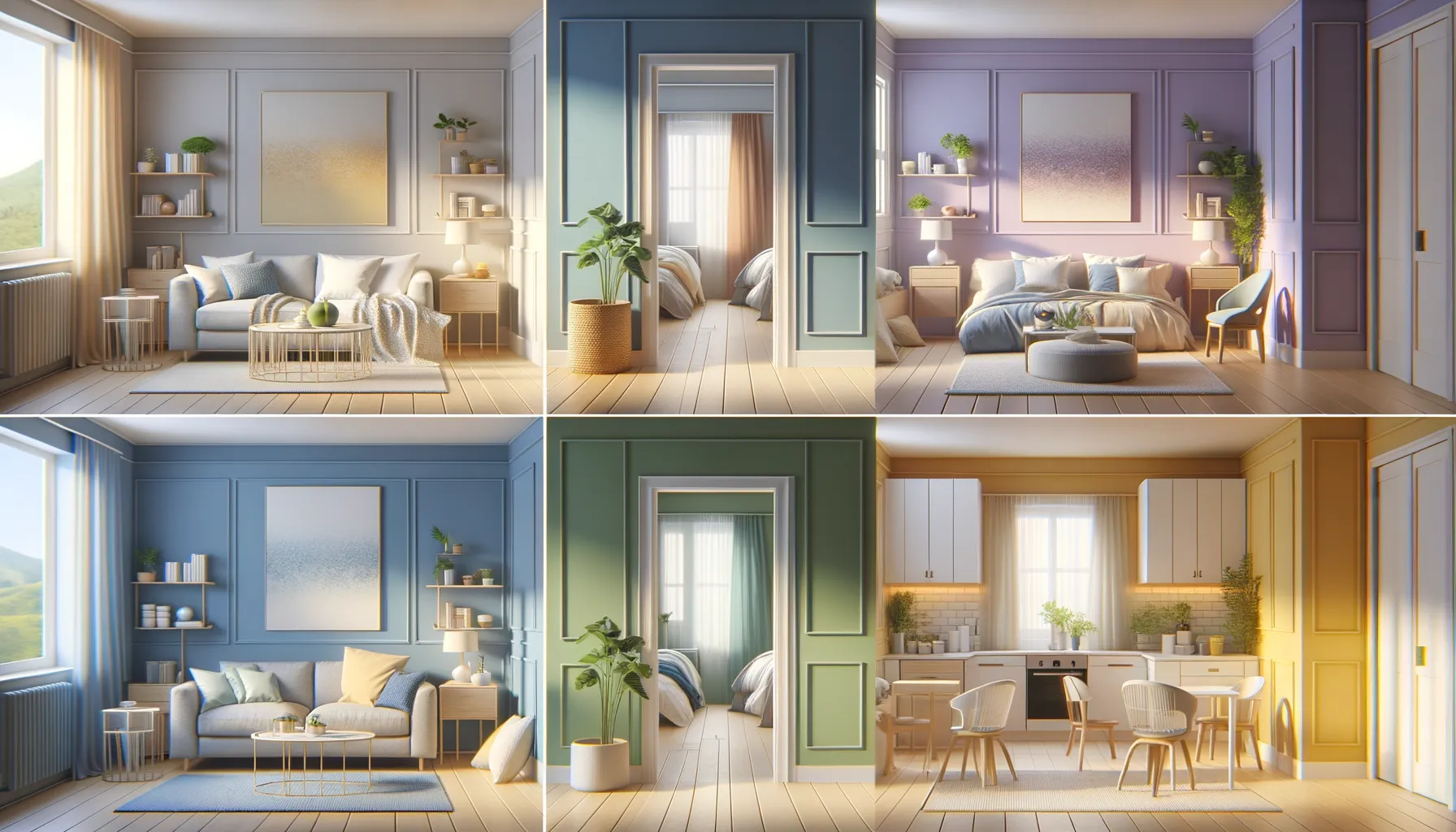
Soft Hues for a Peaceful Bedroom Retreat
Imagine slipping into a room that feels like a gentle hug after a long day. That’s the magic of choosing calming colors for your bedroom. Shades like powder blue, lavender, or even muted sage green have a whisper-like quality that invites tranquility. They’re like lullabies for your walls!
Avoid loud, energetic tones like fire-engine red or bold orange here—they scream instead of soothe. If you’re partial to neutrals, go for soft creams or warm greys paired with textured throws and cushions to add depth. Not sure where to start? Try painting just one accent wall in a serene tone—it’s an easy introduction to calm without overwhelming the space.
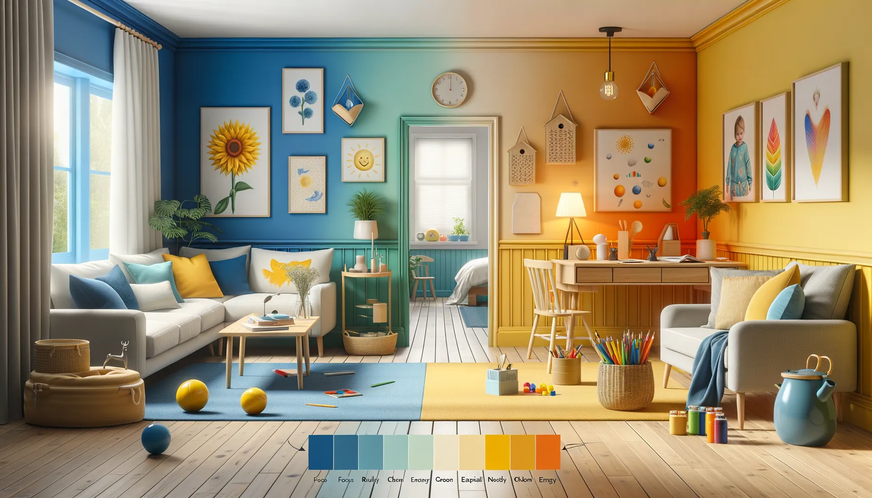
Fresh, Quiet Energy for the Living Room
Your living room is where your moments of rest and connection unfold, so it deserves colors that strike the perfect balance between calm and vibrancy. Think shades like dusty teal, stone beige, or even a smoky pastel pink. These tones are soft enough to relax yet dynamic enough to keep the space feeling alive.
- Teal and beige: Radiates sophistication while soothing the soul.
- Pale pink and white: A dreamy duo for soft, uplifting energy.
- Sage and ivory: Earthy hues perfect for grounding the home.
And don’t forget—your furniture, rugs, and even artwork can reflect these same colors to tie everything together beautifully. Let your living room breathe calm into your day.
The Role of Natural Light and Accessories in Enhancing Colors
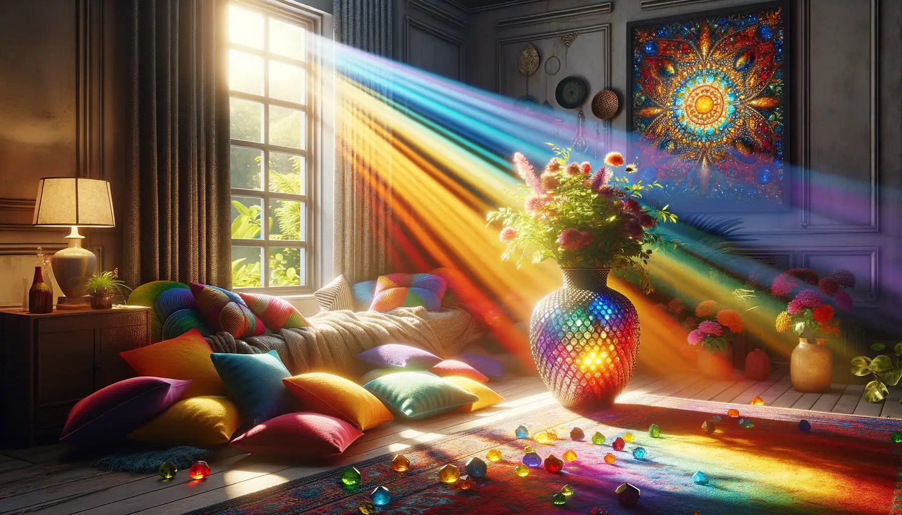
The Dance Between Natural Light and Color
Ever noticed how a color looks completely different in the morning compared to the evening? That’s the magic of natural light. It’s like nature’s spotlight, bringing out the true personality of every shade in your home. Soft sunlight streaming through sheer curtains can make soft blues feel almost weightless, while golden hour gives warm-toned walls a cozy, inviting glow. On cloudy days, even the cheeriest yellows can take on a deeper, richer hue.
When placing furniture or choosing paint shades, think about where light lands during the day. Does your living room bathe in morning light or soak up an afternoon glow? Tailor your choices to complement these changes, and you’ll see colors shift and shimmer like a living painting.
Accessories: The Unsung Heroes of Color
Accessories are where you can have fun playing with contrasts and accents. Imagine a plush gray sofa adorned with sage green cushions—calm but fresh. Or a neutral beige bedspread suddenly alive with a dusty rose throw blanket. Here are a few ideas to amplify your space:
- Mirrors: They bounce light, amplifying the colors around them.
- Ceramics and vases: A single cobalt vase can electrify an otherwise muted palette.
- Natural materials: Think woven baskets or wooden bowls for earthy balance.
A room isn’t just painted; it’s dressed. Treat accessories like jewelry—they complete the outfit!
Combining Colors and Textures for Maximum Serenity
Finding Harmony Between Hues and Textures
There’s something magical about the interplay between color and texture—it’s where art meets comfort, and serenity begins. Imagine sinking your fingers into a soft, woven throw on your sofa, its muted sage green soothing your eyes while it whispers tranquility into your space. The secret to creating true calm at home lies in balancing both what you see and what you touch.
Start with a palette of soothing tones: soft blues, warm greys, delicate blushes, or creamy whites. Now, think textures. A room swathed entirely in smooth surfaces can feel sterile, like a waiting room. Instead, layer tactile elements that invite interaction and relaxation.
- A plush velvet pillow paired with a crisp, linen armchair—hello, elegance and warmth!
- A chunky knit blanket draped over a polished wood bench for cozy-meets-rustic vibes.
- Sisal rugs underfoot that ground your space with an earthy, calming presence.
Let your combinations tell a story. Perhaps the matte finish of a clay vase complements the glossy sheen of nearby ceramic tiles—juxtaposition is your best friend. With every touch and glance, your surroundings should whisper, “Stay a while.”
Tips for Implementing Color Psychology in Your Home
Start Small: Transform One Corner at a Time
Transforming your home with the magic of color psychology doesn’t have to be an all-or-nothing affair! Start with just one corner—a reading nook, a hallway, or even the space by your bedside. Imagine painting an accent wall in a soft sage green to cultivate peace, or adding a buttery yellow throw blanket to your couch for a little slice of sunshine. It’s these small changes that can make the biggest emotional impact.
Not ready for paint? Lean into accessories! Think plush rugs, vibrant cushions, or artwork that whispers calm instead of shouting chaos—it’s all about layering soothing vibes into your existing decor. Over time, you’ll notice the shift: you’ll gravitate towards these spaces as your personal sanctuaries.
Practical Tips for Harmonizing Colors
Ready to go bigger? Here’s how to get it right:
- Stick to the rule of three: No more than three dominant colors in a room to avoid overwhelm.
- Test with samples: Light plays tricks! Observe how your chosen shade looks under natural sunlight versus evening lamps.
- Don’t ignore texture: Matte finishes feel cozier, while glossy surfaces bring energy.
Experiment, tweak, and—most importantly—make it your own!